Have searched board, FAQ, and so on, and couldn’t find an explanation. I THINK I know, but want to be sure.
Perhaps it would be easier to understand this if the term “mode” was dropped and the dropdown list was replaced with three separate controls (since they are in fact three unrelated kinds of things):
- a checkbox called “Checklist” or “Show subtasks as checklist items” (in other words, whenever not in an outline view show this as a collapsed but expandable entity). (This would correspond to the “action mode”)
- a checkbox called “Project” or “Show as project even when empty”. (This would correspond to the “project mode”.)
- a new “item type” called “Info” (in other words, in addition to waiting, someday etc). (This would correspond to the “info mode”)
If none of these are chosen, the default (the “auto mode”) will be (as it is today) that items will be treated as actions if they have no children, otherwise as projects.
HI Bruce;
I think @Folke answer was more of a suggestion to us than an answer to you, so let me jump in here as well. I will also add this the FAQ, thanks for pointing that out! Let me know if the below helps and if you have any other questions.
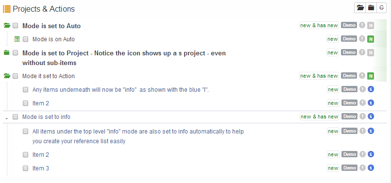
- AUTO - The default mode allows you to create tasks, projects and actions through your normal keyboard steps. You will want to keep it on this setting 95% of the time.
- Project - If you want a single item, without any sub-items to be a project you can choose this mode to overide the autosetting that normally makes any single item into an action. Handy if you know something is a project but haven’t had time to think through the next actions
- Action - Used to create a checklist. Set the top item as mode of action and all items underneath will be of the mode “info” Create for lists of items you want to talk to someone about, etc. The info items do not become next actions. Only the top item is an action. Hence the name “Action”.
- Info - Use this when you want to create a list of information or reference materials. This can be a single item under a task or a project or a whole section on it’s own.
The below picture demonstrates each mode type:
You are absolutely right. It was a suggestion to you, but it also serves as part of the explanation. I remember other people (@Proximo I think) have had the same question earlier. What on earth is a “mode”, generally speaking?
The “culprit”, I believe is the not mainly the term “mode” as such (it would have been almost equally confusing if it had been called “node type” or “visibility style” etc) but primarily the fact that three or four totally unrelated things are being “forced” together under one single term in one single switch, which makes the user begin to grasp in vain for some hidden meaning that all these options might have in common.
Example: If you are driving down a street and come to an intersection it would be very intuitive to be given the three options “left”, “straight ahead” and “right” under a heading called “direction”. It would not be equally intuitive to have the options “apples”, “straight” and “swimming” under a heading called “action” - not even if this turns out to be quite logical; if apples (shops or orchards) can be found only if you drive left; if a beach or swimming hall can be found only of you drive right, and anything else you might want to do or buy is to be found straight ahead somewhere; and the choice is obviously entirely your choice of “action” (to eat apples, go swimming etc).
I think the most confusing of the three non-default options is the Info type. This is so much easier to understand as an alternative to Someday, Waiting, Next etc, but not easy at all to see as an alternative to the Action and Project “mode” settings. But also the term Auto is sure to be confusing; if you did not have this explicit option people would see anyway that things are organized as a tree and that all the higher levels are just “containers” and only the lowest level are the actions that will normally appear on the main lists. But by inventing a term like “Auto” people will start to wonder what this means and they have no way of knowing that all you are actually referring to is the intuitive default tree features. They will start to think that there is yet one more “mode” that they cannot figure out.
Perhaps the term “Forced” could find a very natural use here? “Force Project” would “force” the item to be visible in the container tree even if it is empty of tasks, and “Force Checklist” would force all the sub-items to be included as a checklist even if they had been designated as Next, Waiting, Someday instead of as Info items. Just my 0.02.
All good suggestions @folke and we are always looking to make the program easier for people to understand. We aren’t planning any name changes to that feature right now, but if we do, I will revisit this thread. Thanks!
Sounds wise. I don’t think it would help. And most people will learn how it works, even if it is with some difficulty.
If you want to eliminate the problem one day I do not think a name change will do the trick. I think you will need to make the options into separate features - for example a new “list type” for Info, a new checkbox for “Force Project” and a new checkbox for “Force Checklist”, and simply keep the default unnamed and “non-existing” (existing only indirectly as a non-selection of any of the others).
The confusion arises from even having the default as an option with a name on it (e.g. Auto or whatever) and most of all from having all of these “unrelated” options lumped together as one single feature with a common name (e.g. Mode or whatever). I cannot think of any words in the English language that would make that confusion go away.
The only reason I am not truly trying to use GTDNext is because I don’t understand how to use it or what many of the options or labels mean. I sure hope the app could be simplified one day and maybe I would spend more time with it. If I stare at a UI and can’t make heads or tails on what the terminology means or why I would need so many buttons for making GTD work, I would probably never get past the pain of the learning curve.
Honestly, reading post like this hurts my head and I think to my self, “Why is this app so complicated?”
Keep up the good work and I hope you can achieve simplification in the future. Although I don’t understand your app very much, I would agree with @Folke that renaming things will not help. It’s just too complicated to understand and it probably needs a different approach to what ever it is you are trying to accomplish.
Wish you the best
I am with Proximo on this. I am not currently using GTDNext for the same reasons, it is just not very intuitive at all. I have read David Allen’s book a couple of times, watched videos and understand the concepts of GTD quite well and practice it in my daily work and personal life. I love the outline aspect of GTDNext, but right now that is all I love, so I have moved on to an app that better fits all my needs, but continue to watch things here because I do want to love this app.
The problem I see, again, is it is not very intuitive and the videos are not at all helpful. If you have seasoned users like Folke saying this doesn’t make sense, this isn’t clear, how do you expect new users to feel? Or people who are still getting their feet wet with the concept of GTD? This app is going to turn them off. I see in here time and time again where users express their concerns, make valid suggestions, and I keep hearing, we have no plans to change that or institute this. I realize it is your program, your design and your dream, but if you don’t make it intuitive and user friendly, you won’t be around for long.
When I saw you had started offering subscriptions, I had mixed feelings. Mainly, it was who would be willing to pay for an app that is not yet ready for prime time, so confusing, has no mobile app, no ability to link files, etc.? I know I sure am not willing to do so. And I have no problem paying for something that is useful, keeps me organized and makes my life less stressful, and am currently paying $10 a month for the app I use. At the same time, I am thinking, well, maybe if there are people willing to pay for this, they can hire additional developers to move things along, get more features and a mobile app, then it would maybe be worth paying a subscription for. But right now, no way. Not yet. Sorry.
Well – as the person who started this thread <g>, I’d like to make a few comments:
– The Mode control is now clear to me. It’s the Mode of the highlighted item: normal operation, make it a project even without subitems, make it and its children a checklist, or make it and its children note containers. So, while there might be a better way to label it, the function is clear – and helpful.
– As to the app design and whether or not it is intuitive – this seems to be primarily a complaint about the outline structure, and the use of Tab (indent) to indicate child items. Frankly, I think this is one of the best ideas the designers have had. It immediately solves so many problems other tools have had, namely, the need for subprojects, subtasks, high-level goals, various horizons, and so on. If you are used to using any of the other tools, Proximo is right – it is not immediately obvious. In fact, I was put off at first by the use of Tab. But the longer I have used the tool, the more I have seen the value of the design. I can enter data quickly, I can move around quickly, and it takes up very little screen real estate. And, being primarily text-based means it is much more responsive.
I have already paid for the Premium subscription, because I want to see the development continue, and especially because I want to see mobile device development of some kind. But for now, I’m fine with the approach. And I’m fine with Mode, too. 
Actually, I noted that I love the outline aspect of GTDNext. That isn’t what I find to be non-intuitive.
1 Like
Great thread, I appreciate all the great dialog. We hear you!
In a former life I spent a lot of time working with a UX (User Experience) team where we ran dozens and dozens of prototypes by real live actual Microsoft customers/users.
This made for greatly improved UI (user interface) designs for the products I was in charge of. So I know how important this process is. I also know it’s very expensive to implement for a small company like ours! We won’t be able to do that level of design work, but hearing your feedback is nearly as helpful.
We will continue to think through these designs and eventually try out some more ideas.
I’ve said this before, but it bears repeating. All software is complicated. I’ve been part of dozens of software projects and the only reason a product seems simple is usually because it has had hours and hours of design discussions to make it that way.
Rarely does it come “out of the box” feeling “simple”. It’s our challenge to make it seem simple, regardless of what mental models you bring to the table. So thank you for the feedback.
What we have learned is that people with experience with outline software “get” our interface almost immediately. Making it simple for the rest is the challenge!
Finally I’d like to say a big hearty THANK YOU! to Bruce. He is a model citizen and worth emulating by many! 
I want to make something clear.
If I were a developer and trust me, I am not. I would attempt to make a very simple GTD app that covers the basics of the methodology. I would launch a beta program and get some users involved and then spend the next 2 years adding features, structuring the app to handle the features, rip out the framework and rebuild it to allow more features to work, etc.
My point is this. If you build a simple app, you may have a simple foundation that would not allow drastic changes down the road. If you build a complex app, you may have a complex foundation that would not allow for drastic changes down the road.
Your original vision may not work as intended regardless if it’s simple or complex. A simple infrastructure may not support drastic changes which can lead to problems. A complex infrastructure may not allow simplification due to the way it ties things together.
You have to put something out there and see how it does. Listen and make needed changes.
You are doing a great job as a developer to get something out there and no matter which side of the road you came from, you will meet similar challenges. So keep moving forward and embrace the journey. I know that sometimes you may be thinking, “What did I get myself into”, but all great people have made that statement at some point in their life.
“The world ain’t all sunshine and rainbows. It is a very mean and nasty place It will beat you to your knees and keep you there permanently if you let it. You, me or nobody is going to hit as hard as life. But it ain’t about how hard you’re hit, it is about how hard you can get hit and keep moving forward, how much can you take and keep moving forward. That’s how winning is done!” - Rocky Balboa
I am with @Susan here. The Workflowy style editing probably is a certain challenge, but I don’t think it is the actual problem. Besides, most of us probably appreciate the power of having unlimited hierarchies. The real problem lies in all the little details all over the place that are half-finished or difficult to make sense of.
A good example of this is the topic of this very thread, the Mode switch and how that relates to things. If we create a task and see in the edit pane “Mode: Auto” as one of the things we can adjust, how intuitive is that? What effect is it meant to have? And what effect do the alternatives actually have? Let’s say we choose “Mode: Action” (the checklist option):
We all want to be able to create checklists (actions that can be expanded and show detailed sub-tasks). It is really great that GTDNext tries to provide for that. It really is a very useful feature to have.
But even if we learn somehow that we can use the Mode switch (Mode: Action) for this purpose, we still do not really get a checklist. We do not really see much effect. It does not make sense. We still have to go to the outline mode to see the sub-items, just as if we had called it Project or Auto. And it does not work at all for the most common and important checklists, the repeating ones (because for repeating actions the sub-item spots are used as a logbook of repeating instances, not for checklist items - how intuitive or useful is that?).
So, all in all, we find it hard to understand what the feature actually does do now and will do eventually, and we do not really get much clarification from the developer. Essentially, we can all see that it is not a finished functional feature, just a “stub”. This might have been perfectly OK for now, because we all understand that the app is only in the early stages of its development, and we are all here to help and to perhaps have some influence on a product that we hope will be good enough for us to use. But then we get to hear that “No. We have worked hard and fast and are proud of it. The app is launched. We even charge for it. We do not plan to make any changes.”. I am sure this makes many people wonder if and when and how a checklist feature will be there for us in the future.
And the same goes for other features and design choices in the app (project action logic, focus logic … just to mention a few notable examples.).