I watched the video showing offline mode on your iPhone X and fell in love with GTDNext. It looked like the perfect balance that I had been looking for of GTD features, presentation (compact lists), and pricing. I eagerly signed up, saw the desktop web-app, went to my Pixel 3, and was heartbroken to find the mobile layout on Android is so broken as to be unusable. Please see the problems I encountered.


Hi @TheBashar - Thanks very much for the detailed report. Very helpful. No doubt the mobile view has a long way to go. Our goal was to provide a lite version of GTDNext for people on the go, not a full replacement. But it’s clear even that goal is still not met. For you, what is are the most important mobile features that are missing? (or not working correctly)
thanks again, I know it took some time to capture those shots and make this post. Much appreciated!
Hi @James,
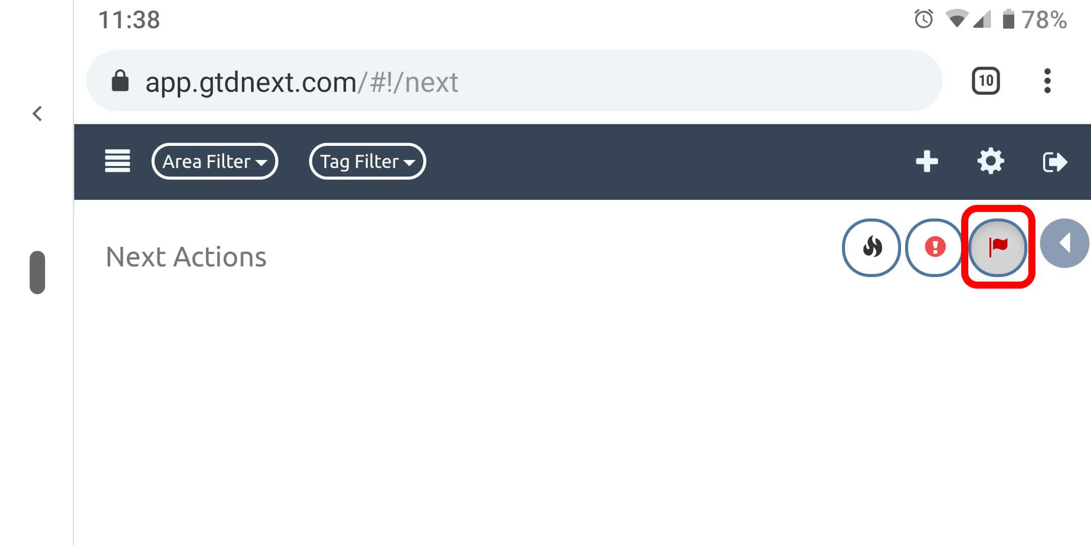
Thank you very much for the reply. For me, the most important mobile feature not working correctly is the dynamic layout / reflow, particularly in portrait orientation. YouTube is the only app I’ll rotate my phone for. Please notice in all the portrait orientation screenshots that the plus, gear, and exit icons are 1) invisible, and 2) overlapping the focus, priority, and sidebar icons. That makes it impossible to use. Every time I tried to open the sidebar I got immediately logged out from the overlapping exit button.
Thanks again!
Hello again @James,
So… I feel like an idiot. Before I took all the screenshots I checked to make sure my Android setting “Large font size” wasn’t the cause of the layout problems. It wasn’t. Tonight my Pixel got the Android 10 update and I was looking in the menus to see what was new. I saw there was also a “Display Size” setting which I had set to “Large”. I set it back to “Normal” and almost all of the layout problems I documented went away. Sigh… Hooray!
There appear to only be 2 issues left with the layout:
-
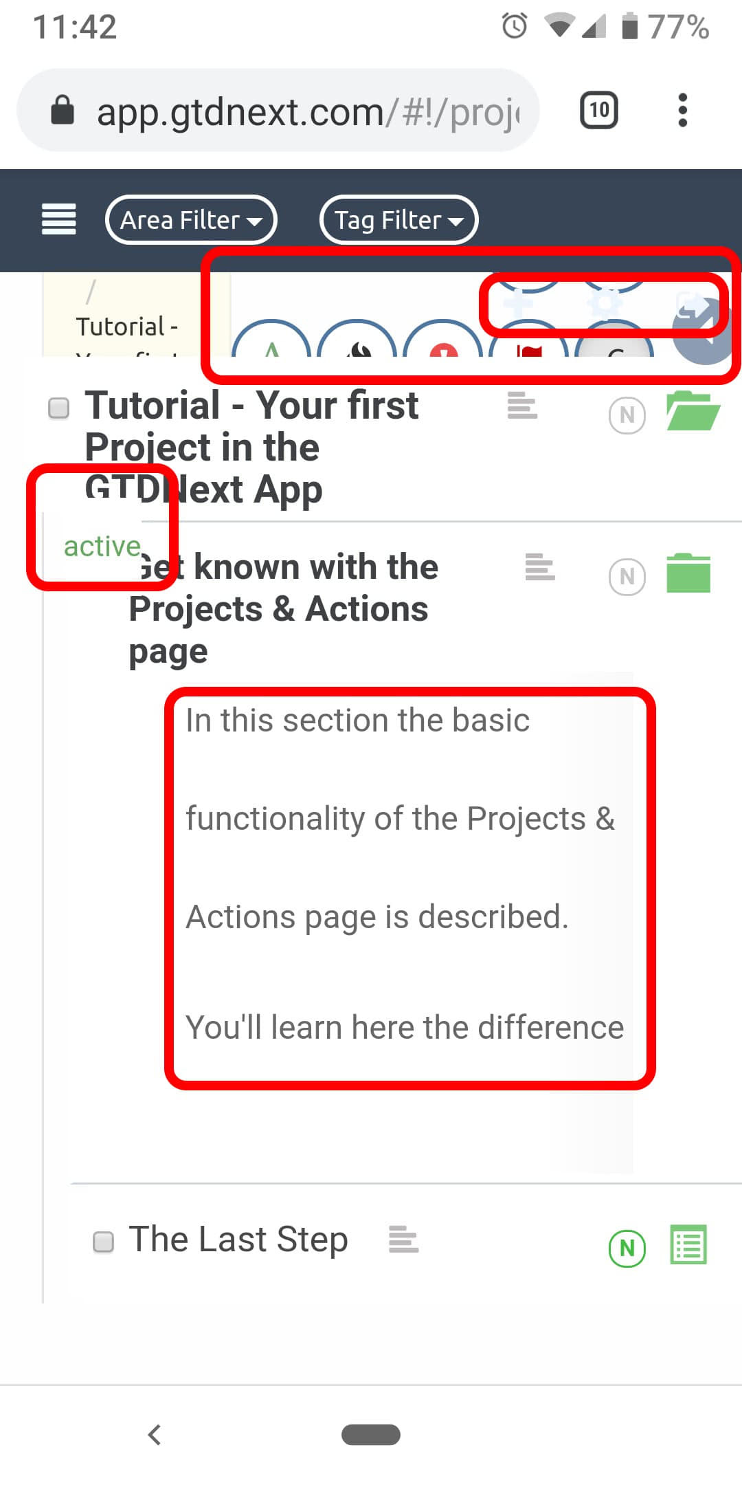
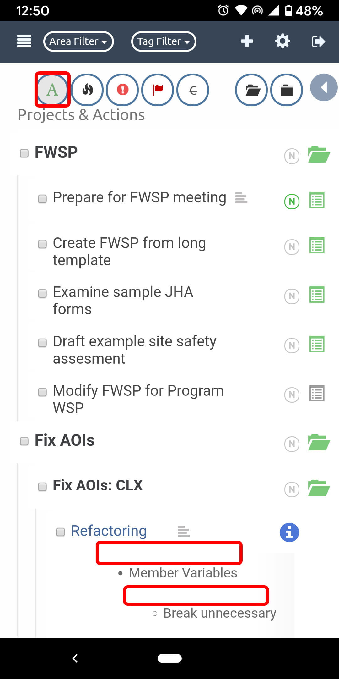
The last used quick filter at the top has a medium gray tinge even when it is turned off. In the picture, I turned on the “Active” filter, it turned dark, then I turned it off, and it turned lighter - but still darker than normal. See how it looks half-activated but the “Someday” gray task is still showing. If I tap on another quick filter, like due dates, the gray effect leaves the Active button and moves to the now most recent filter button.
-
The task notes in the expanded sidebar look normal. In the inline expanded notes however, the notes are shown with an extra blank line’s worth of space between every line. That really takes up a lot of the limited vertical space.
Thanks again for your time! Sorry about all the line noise with the previous layout issues that were caused by the android display setting.