Just wanted to write to see if there were plans to implement any type of formatting or coloring of tasks to denote different things? One common use case is to color tasks to denote priority levels. Other use case it so color code to denote waiting for or differentiate who your waiting on the task from. Like others have shared on the forum, I find the use of color as a key way to drive my attention when reviewing a long list of next actions. I hope that at some point, the use of coloring will be implemented for this purpose with some level of flexibility so that the user can create their own rules and have it apply as they see fit. MyLifeOrganized has this “custom formatting” feature in their application and I always found that to be helpful as I could set up a formatting rule (any active task that has X tag gets formatted like this) as I wished. Just a thought.
Hi @hntopper - The short answer is that there are some ideas around this, but no solid plans yet. We have some other work to get done first. The Mylifeorganized idea is interesting, we will have to take a good look at what they are doing when we get back to thinking about this feature. Thanks for the suggestion!
How about this? Nice, simple picture, huh?
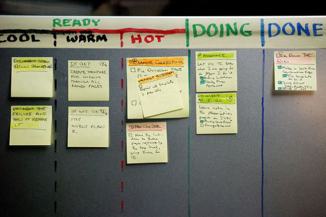
It comes from a lifehacker article: http://lifehacker.com/productivity-101-a-primer-to-the-getting-things-done-1551880955
Assume “Ready” means “Next action, not yet started”, and “Doing” means “Next action, already in progress”. Then this corresponds to @hntopper’s wish for being able to visually distinguish between actions in progress vs actions not yet started. I would not object at all to having that feature although I am not quite sure what I would use it for, but I am sure I would find good use for it somehow.
And the levels Cool, Warm, Hot seem to correspond exactly to my use of a Priority field to reflect the task’s required “Review Attention”. This is something I find extremely valuable; I cannot manage well without it.
This looks really good. It captures what I was trying to convey very nicely.
Thanks all - yes, this is a pretty cool way to look at it. We are still thinking about this feature so thanks for giving us more to think about!