Wednesday, January 18th, 2017
I’m happy to announce that today we have launched the UI update for GTDNext.
In this new UI will notice several differences. We focused on upgrading the look and feel of GTDNext. A more modern UI. At the same time we didn’t want to radically change how users interact with the app as our users have told us they like how GTDNext works.
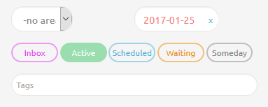
One example of change is how the area filter works. In the past, we had two different methods of changing the Area filter. This was often confusing for new customers. We’ve combined the features of those two approaches into one feature.
As you play with the new UI, you will discover a few other differences as well. Feel free to ask questions on the forum here if you have any trouble.
A big thanks to our preview team for taking the time to review the new UI. The feedback from the team was very valuable!
Oh and if you notice any issues, hit CTRL+F5 on your browser a few times. It will take a few refreshes for all the old files to go away.