Hello
This is a small suggestion for your UI graphics. The circle with an X in it looks for all the world like it would delete the task. Whereas in fact what it does is collapse the right hand panel. Surely a triangle pointing to the right would be the more obvious graphic to use.
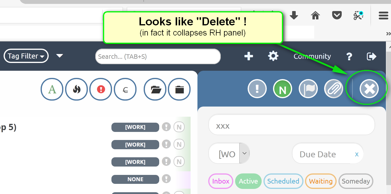
I would suggest you simply flip horizontally the graphic that opens the RH panel.
==> i.e. so that it looks something like this:

No big deal, just that as it stands it’s slightly confusing for new users.
J